Ormond Masters Office
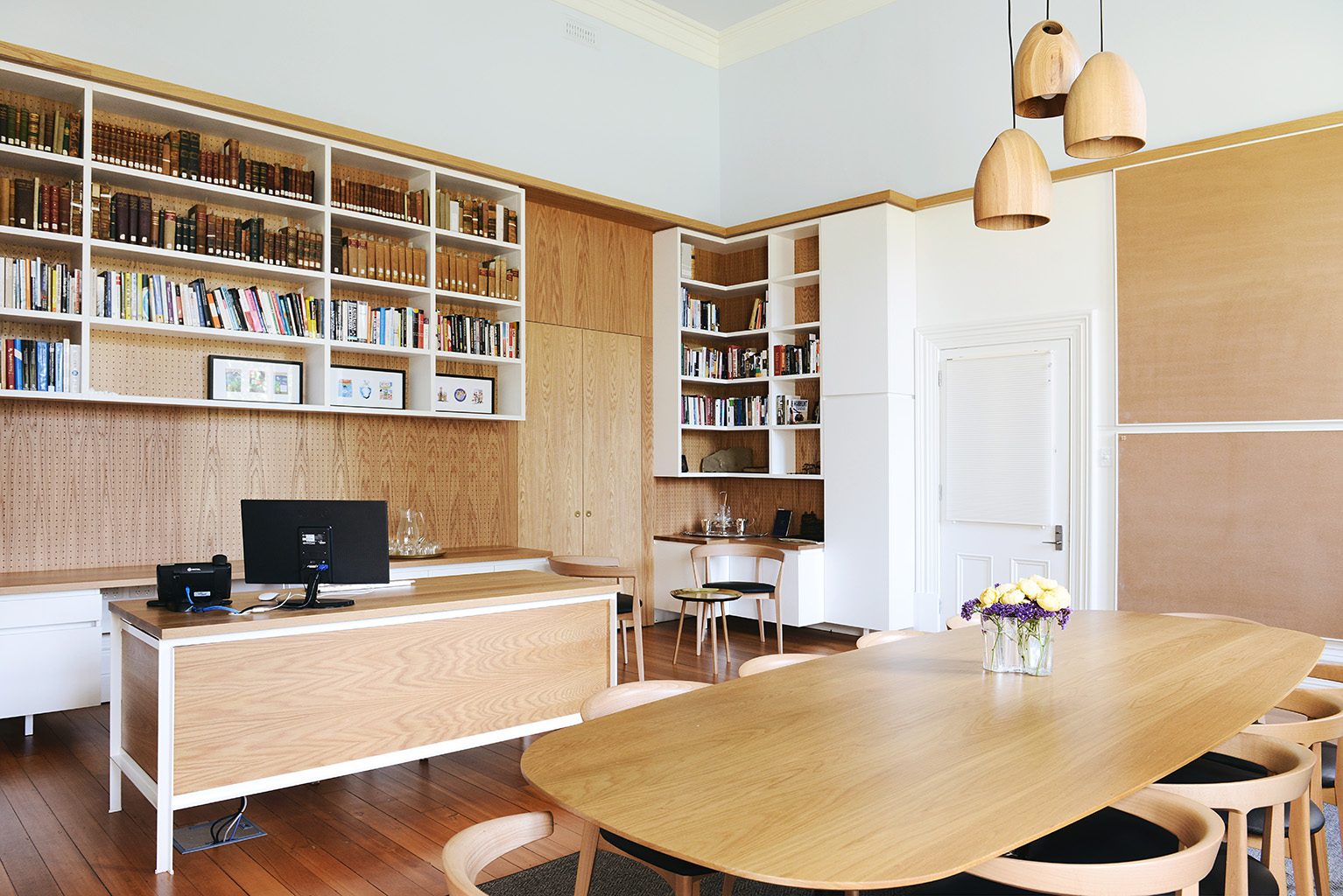
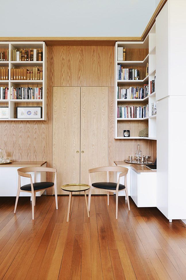
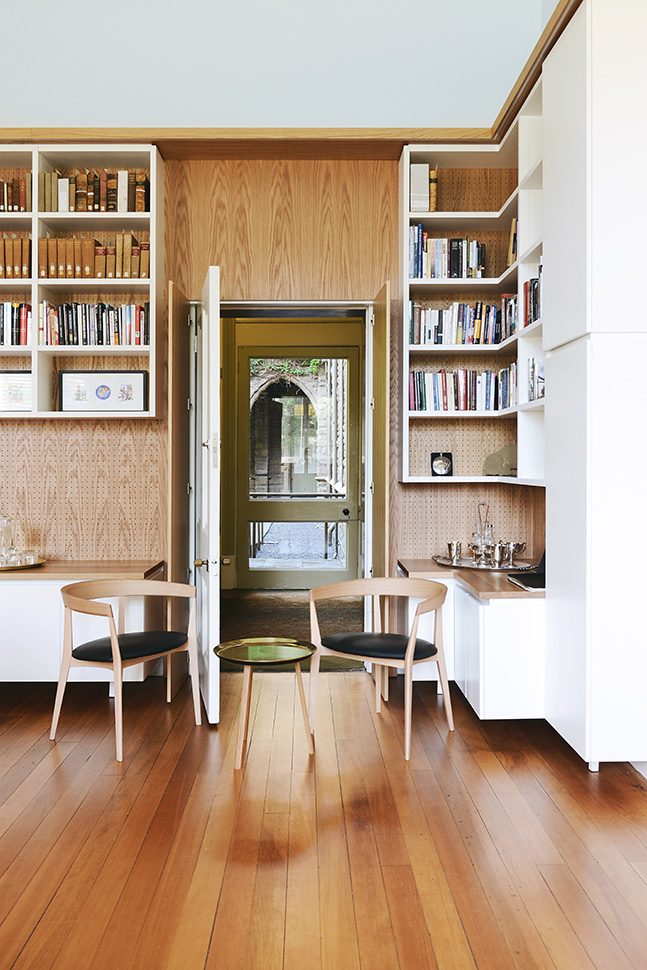
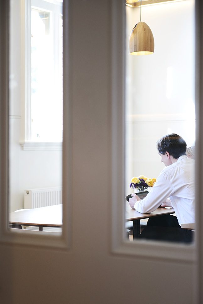
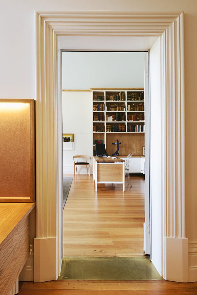
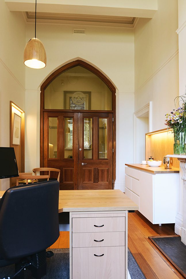
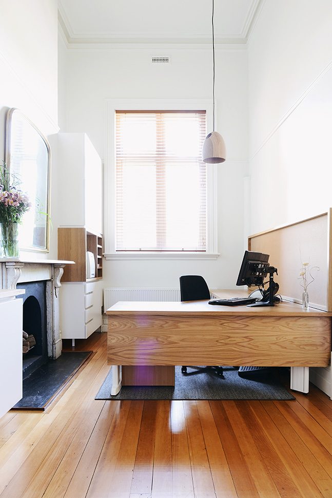
When a student kicked a football into the fire sprinklers on the floor above the master’s office, the college took the opportunity to refit the existing office and assistant’s office in a style that reflects the personality and values of the modern college. Our brief then was to design light, welcoming, open, and modern spaces with a classic and somewhat timeless feel.
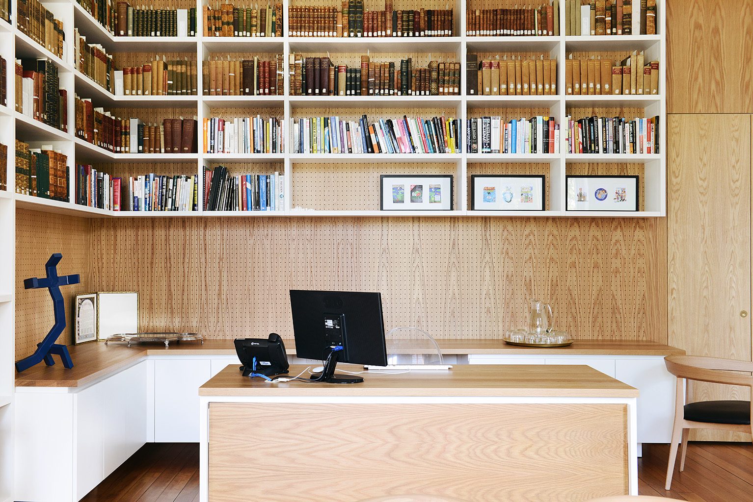
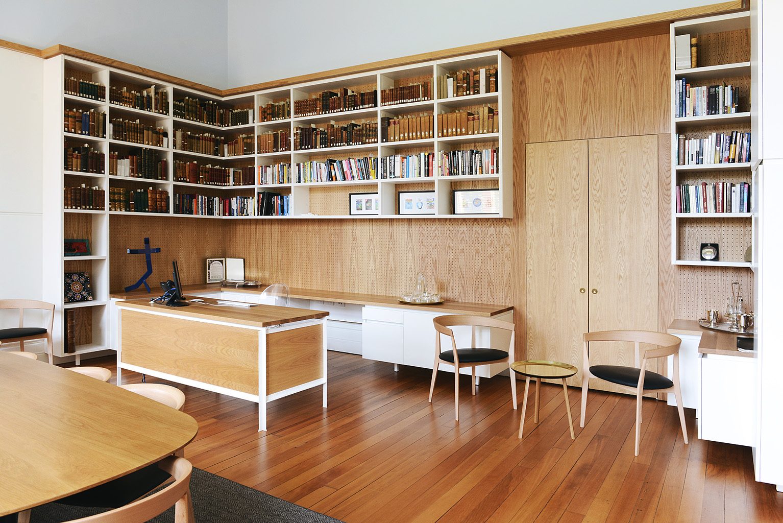
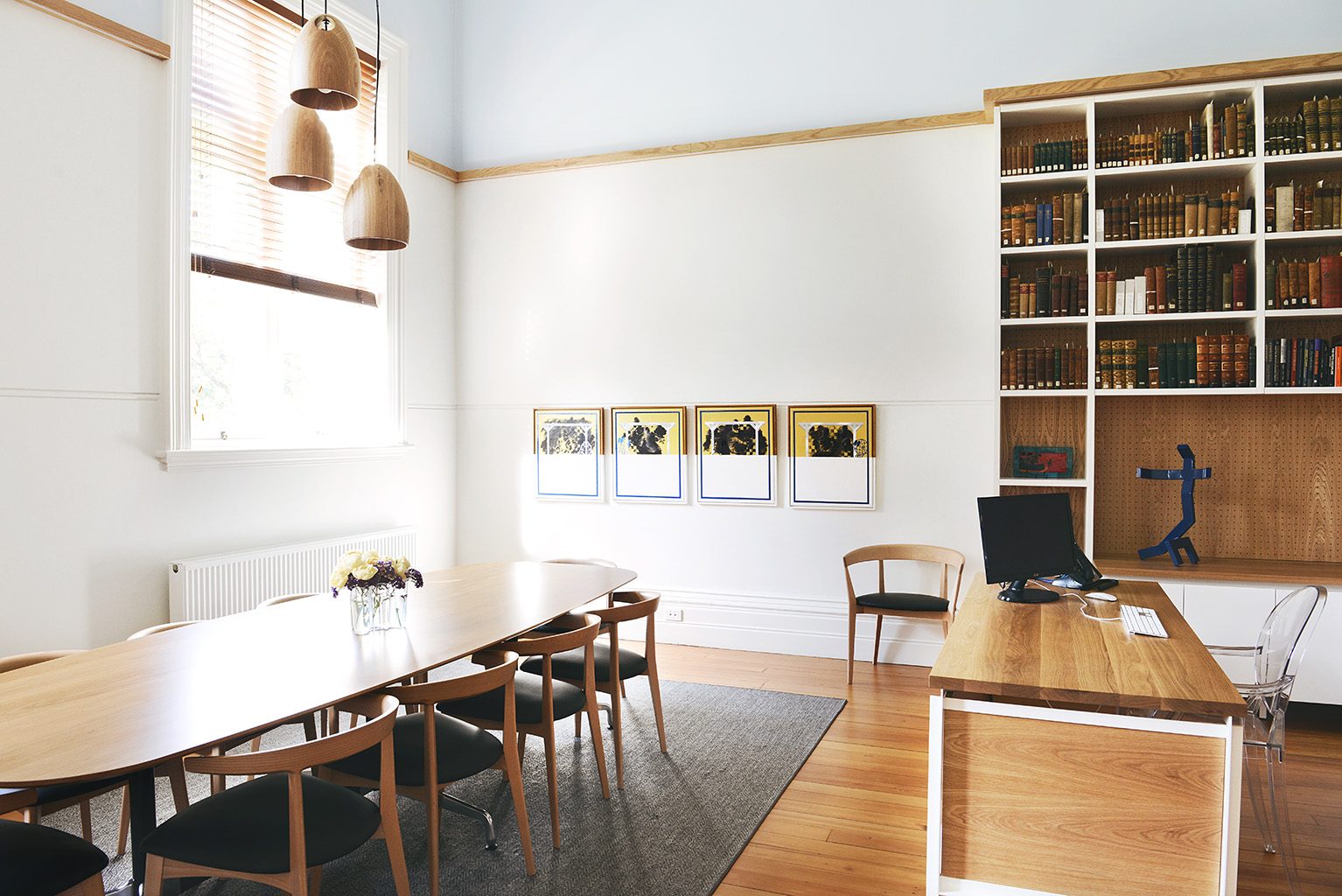
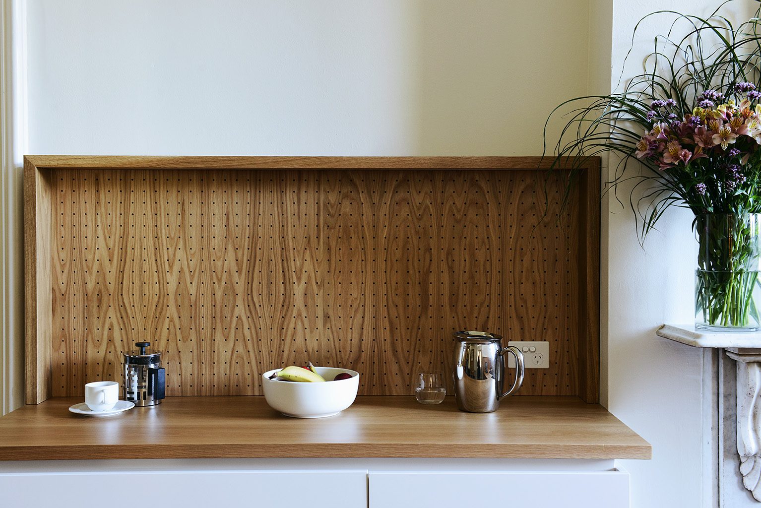
The palette comprises American oak solid timber and veneer, white painted joinery, and loose timber leather furniture. The hint of blue above the picture rail references the colour of the sky outside. The perforated timber panels absorb sound and add interest to the space. These elements, combined with the college’s remarkable collection of books, create a series of spaces that announce the college’s modern vision.
Selected Media:
- Client
- Ormond College, Melbourne University
- Year
- 2014
- Team
- Emilio Fuscaldo, Imogen Pullar
- Builder
- Krueger Shopfitters + Commercial Interiors
- Photos
- Lauren Bamford
